CONTENT AND LOGOS HAVE BEEN MODIFIED FOR CLIENT CONFIDENTIALITY. THIS IS EXCLUSIVELY TO DEMONSTRATE THE VISUAL DESIGN.
Sector
Corporate Learning and Development
Output
- Redesigned slide deck
Skills
- Presentation Design
Tools
- Powerpoint
- Adobe Photoshop
Background
The client wanted to revamp a proposal deck, which is typically sent as a PDF file to company executives.
The current deck was text heavy and lacked spacing, making it challenging to read. However, most of the text was crucial to the proposal so it was not an option to cut out a lot of content.
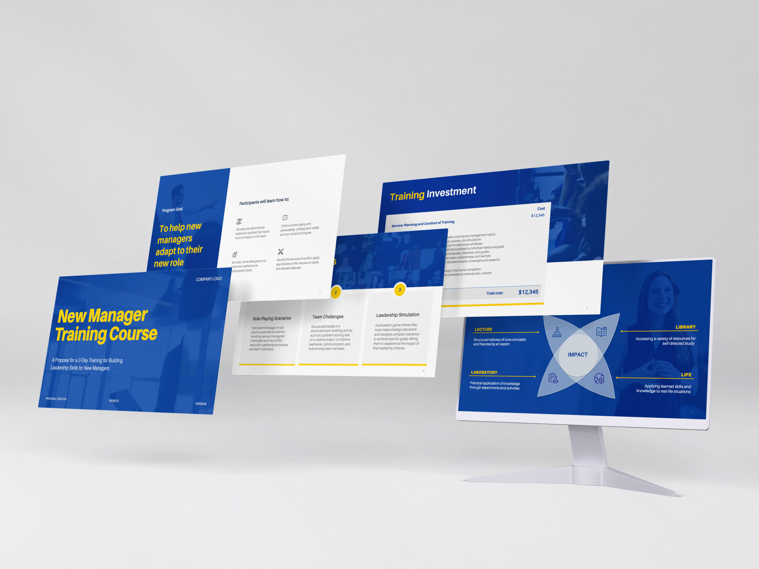
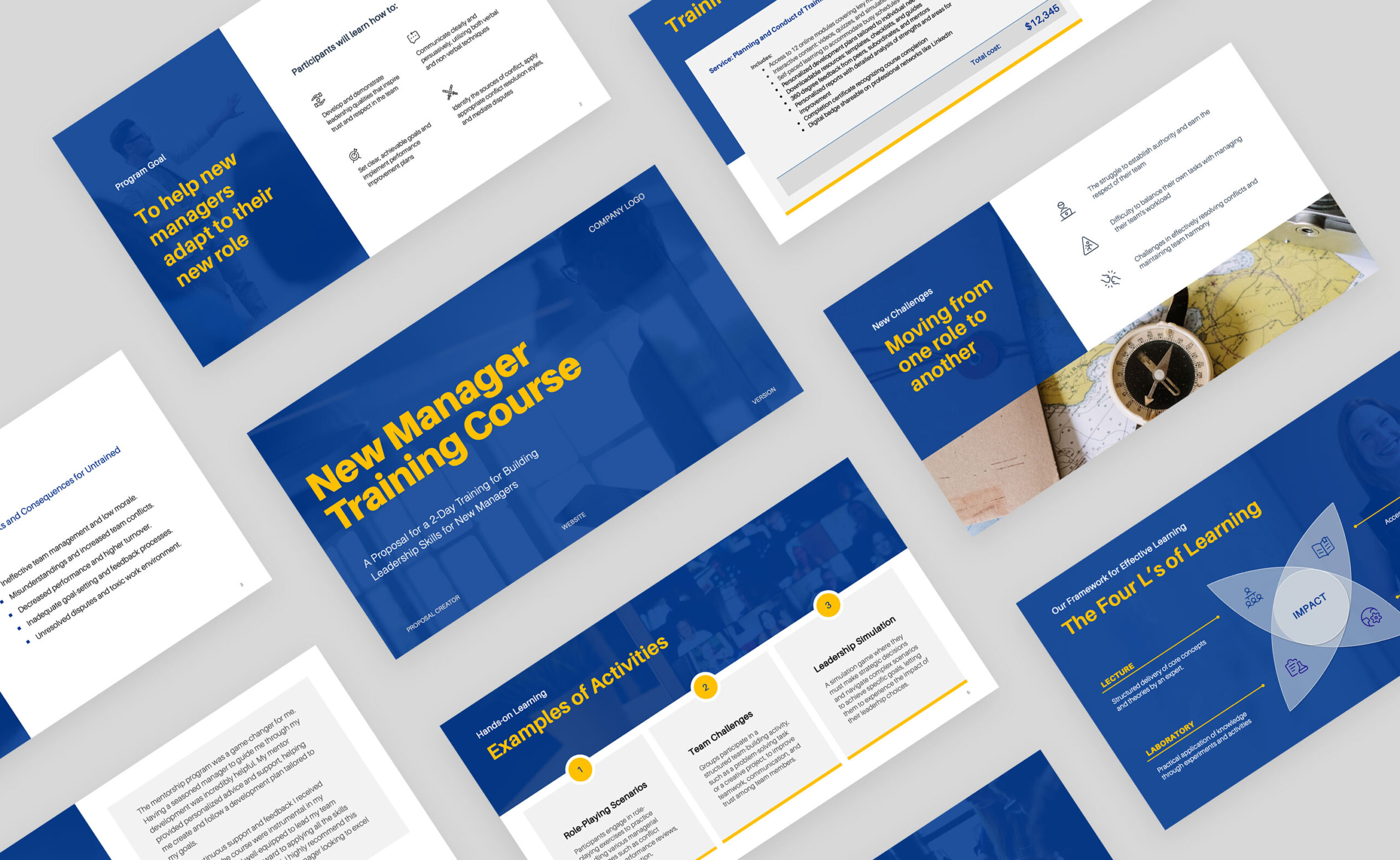
For this project, the goal was to re-layout the existing content and apply visual changes that will make it easier to read for busy executives.
The original deck and brand colors were provided to me as reference.
Approach
To approach this, I made the following design adjustments:
- Apply clear text hierarchy and different fonts for the titles and the body to make them more distinct
- Add subtitles to add context to selected slides
- Add a colored sidebar to some slides to contain key ideas, leaving a white area for the details. This way, executives can easily skim the deck for key ideas while having the option to read the details later.
- Convert bullet points into custom diagrams to make them quicker to grasp
